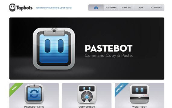
Tapbots are utility robots for iPhones, iPods, iPads and Macs. Here’s designer Mark Jardine of Tapbots from an interview with Aarron Walter whose work on emotional design I’ve presented several times in this blog of late:
The whole UI concept was really inspired by the movie, Wall•e. They were designed in a way that you could practically guess their function by the way they looked. I really loved that. So when we set out to design Weightbot, I wanted it to resemble a typical weight scale. With Convertbot, we wanted it to feel like it was in the same robot family, yet was designed specifically for the purpose of converting units.
Our concept for the first 2 apps was selling our apps as if they were physical robots. That’s why the icons resemble the interface. We also gave the icons eyes to humanize them a bit. But we use this idea as a selling point and not to distract the user in the actual app. We want our apps to be used seriously, but also give the sense that they are more than just a piece of software.
We did want our users to have an emotional connection to our apps. Most people don’t have a love/joy for software like geeks do. When I switched to the Mac (from Windows), I began to appreciate software design and found great joy in using software that was carefully crafted. Our goal was for everyone to be able to feel like that about software.

Pingback: Intercom’s anthropomorphic logo | wpossidento